

THE BRIEFX‑Energy is redefining nuclear energy with a focus on planet- and people-first reactor and fuel design.
Our mandate was to bring the brand up to speed - translating advanced nuclear technology into a visual and verbal identity that felt modern, accessible, and consumer-friendly, without diluting credibility.
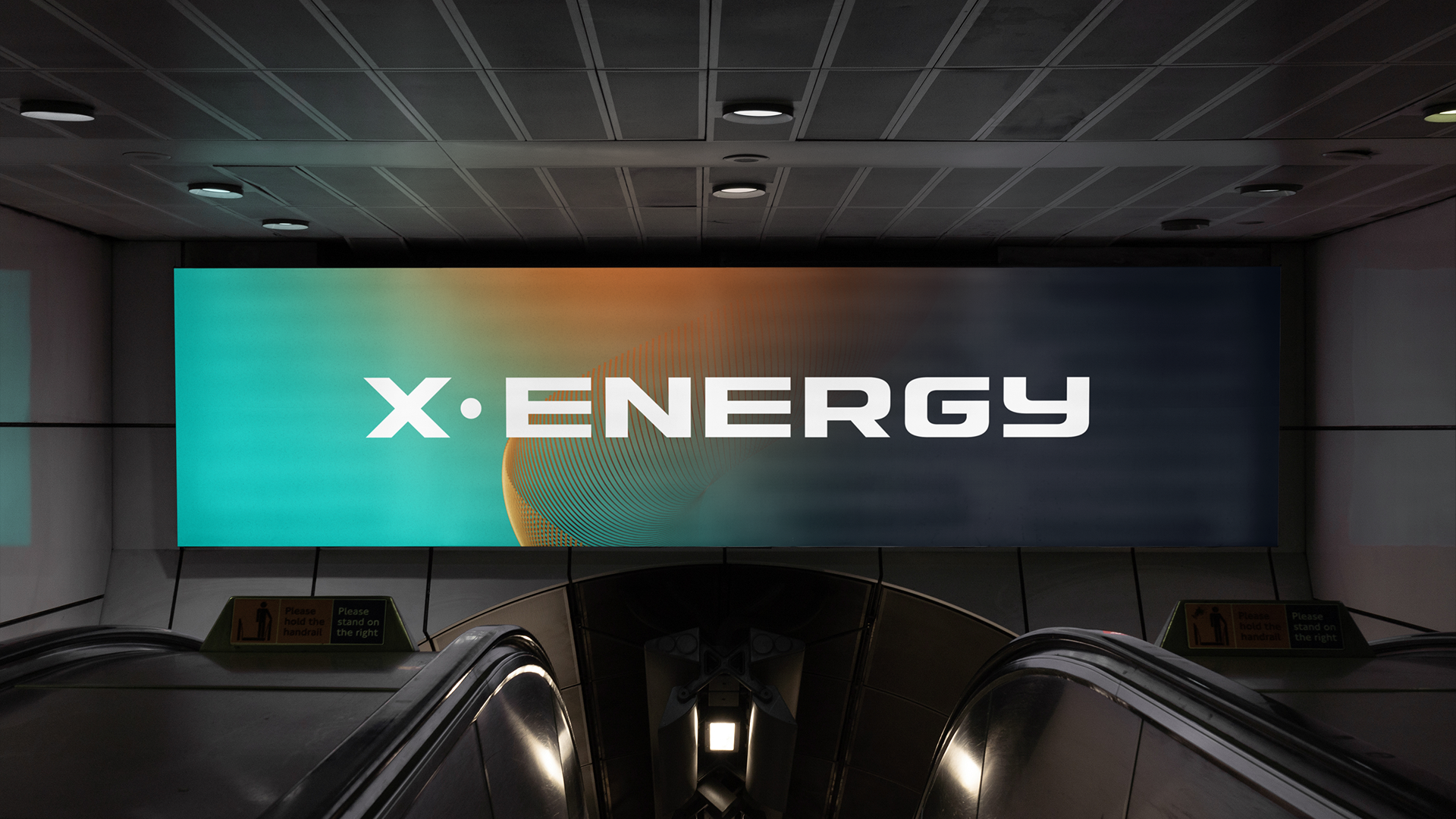
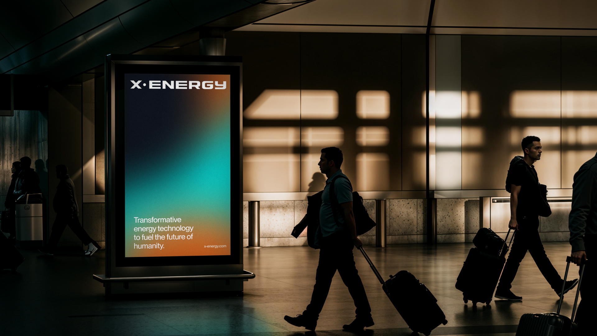
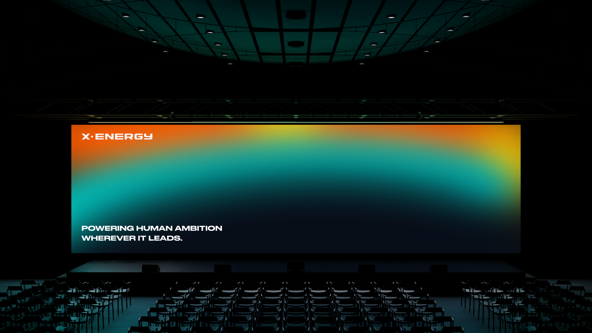
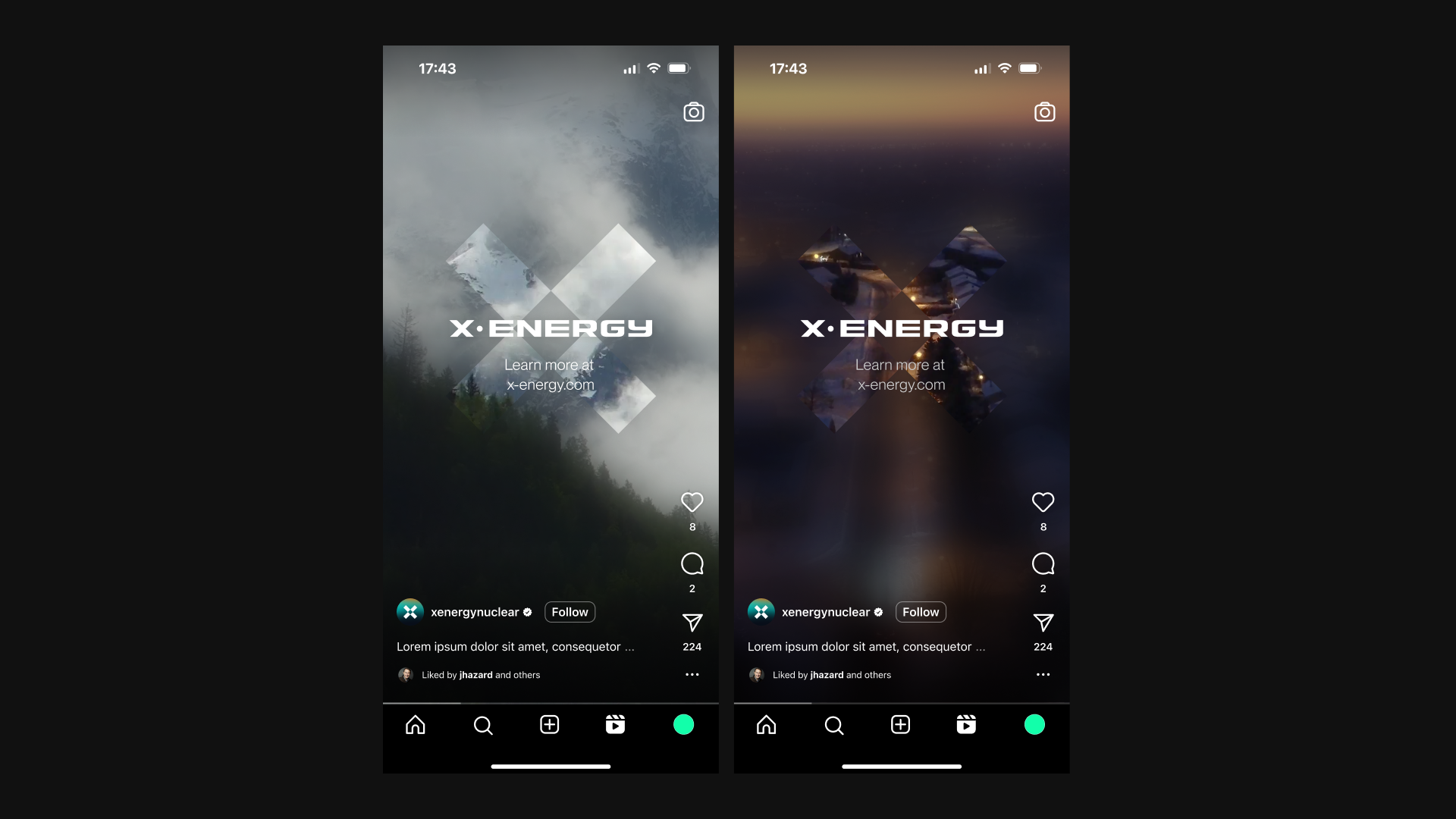
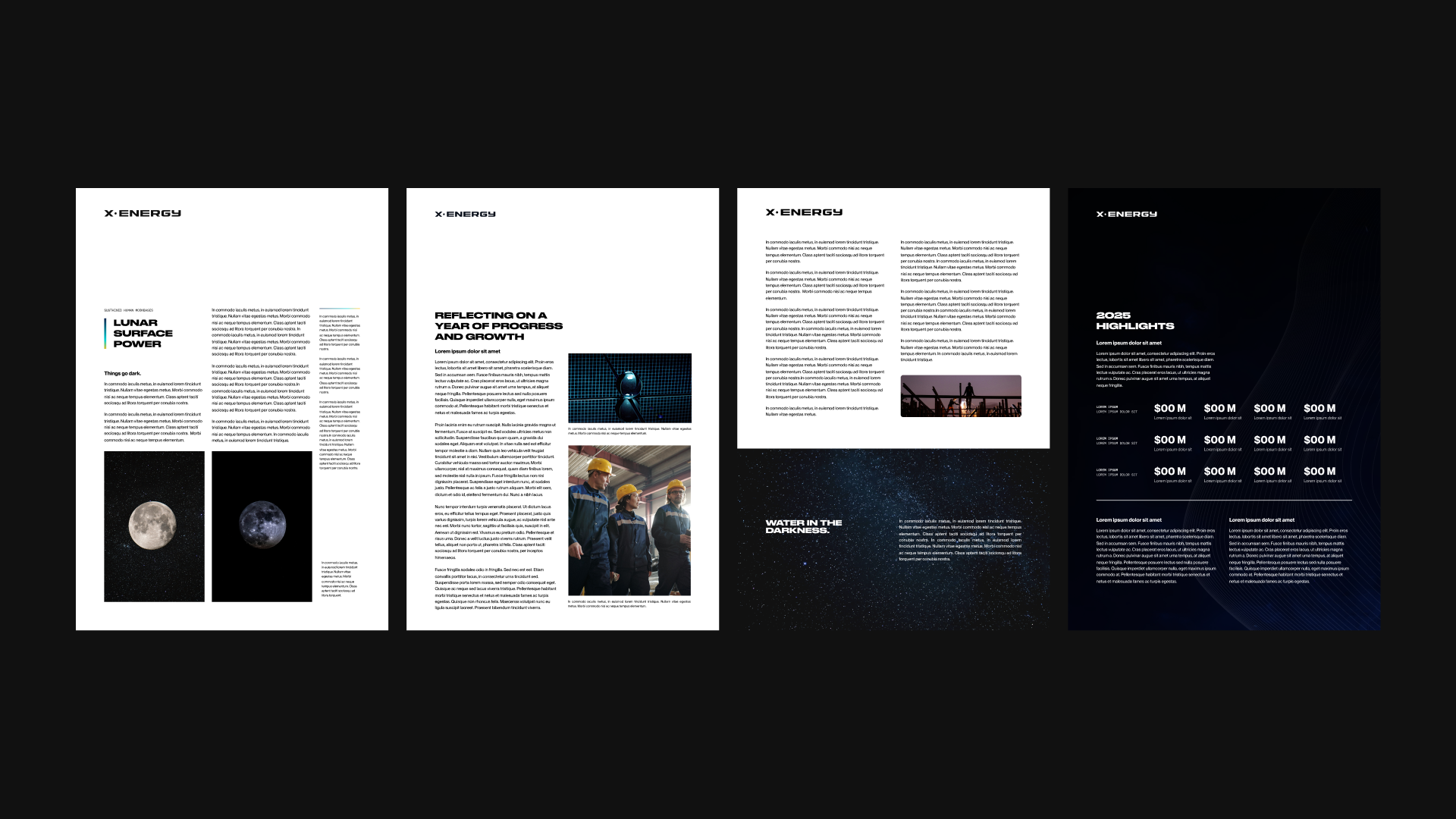
Built entirely from the ground up, the work spanned look and feel, wordmarks, logos, social presence, and landing pages - a complete brand system designed to make the future of clean energy feel tangible and optimistic.
The first challenge was alignment. X-Energy’s existing logos varied across its three sub-brands, and the colour system lacked cohesion.
Our task was to establish consistency without losing warmth. Leaning into an organic, consumer-friendly direction the client responded to, we explored two refined colour palettes and two new logo directions alongside the existing marks - pressure-testing the system before locking it in.
INITIAL DESIGN DIRECTION

EXISTING LOGO + ENERGETIC CONSUMER TEAL
NUCLEAR ORGANIC LOGO + ENERGETIC CONSUMER TEAL


FUTURISTIC & MODERN LOGO + PASTEL PALETTE
EXISTING LOGOs

Next, we focused on refining the brand’s core identifiers - exploring logo, symbol, and wordmark directions to define the right visual language.
We tested alternatives to the existing symbol to clarify what should lead the brand forward. Earlier concepts - including the more overtly Nuclear Organic and Futuristic routes - helped set boundaries, but ultimately fell short.
From a broad exploration, we curated a focused set of final directions aligned to X-Energy’s goals, balancing credibility, accessibility, and long-term flexibility.
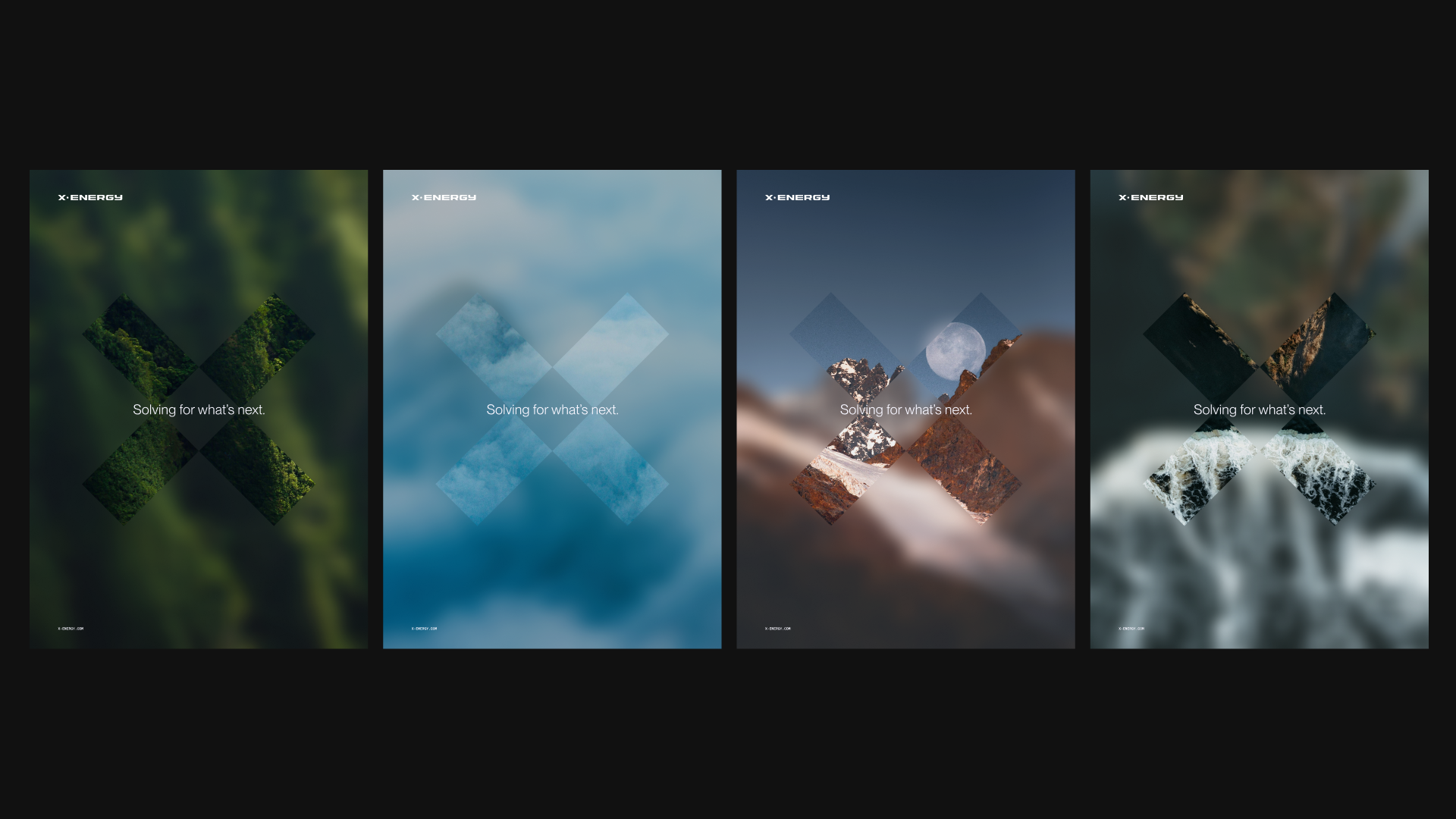
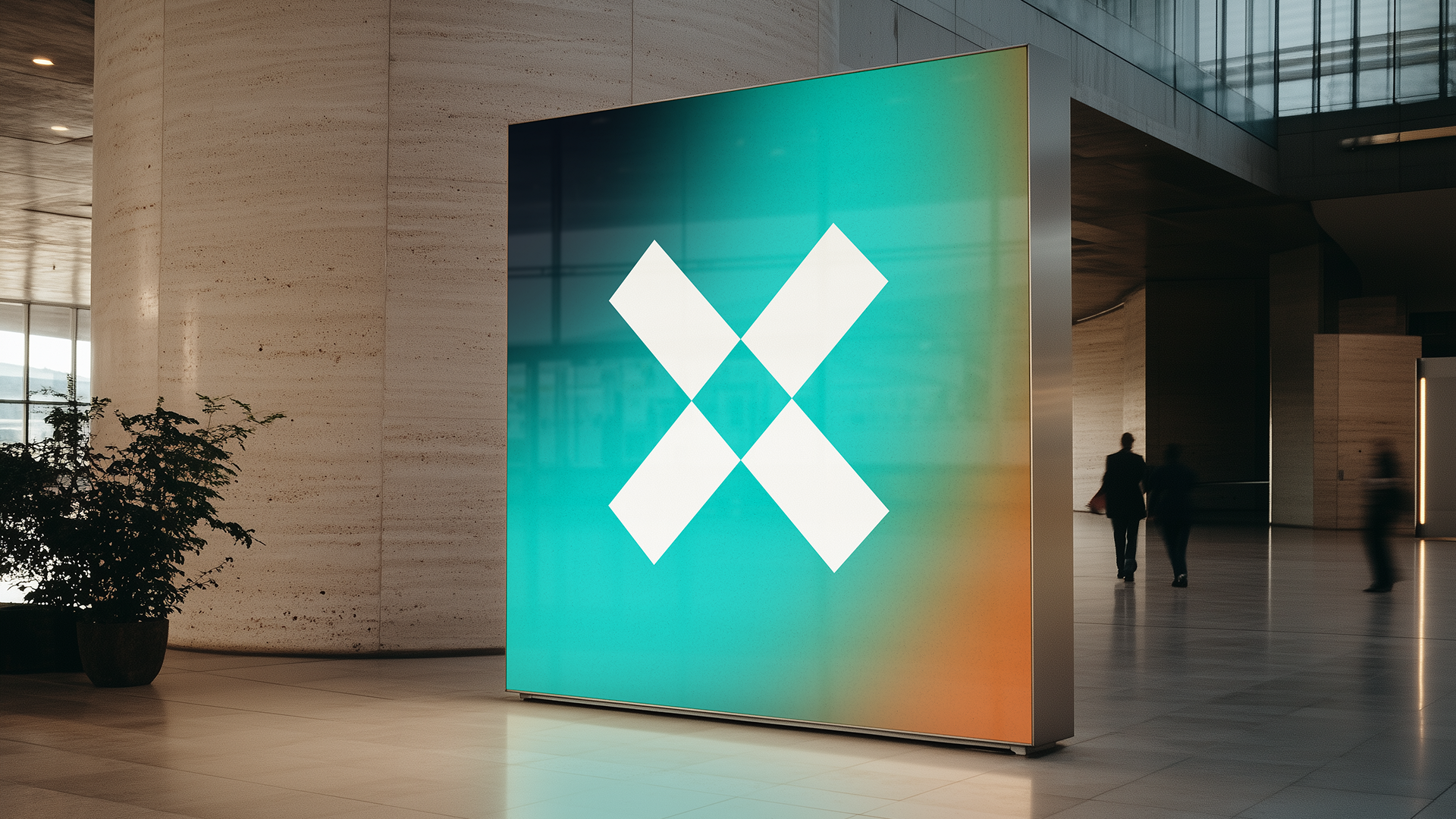
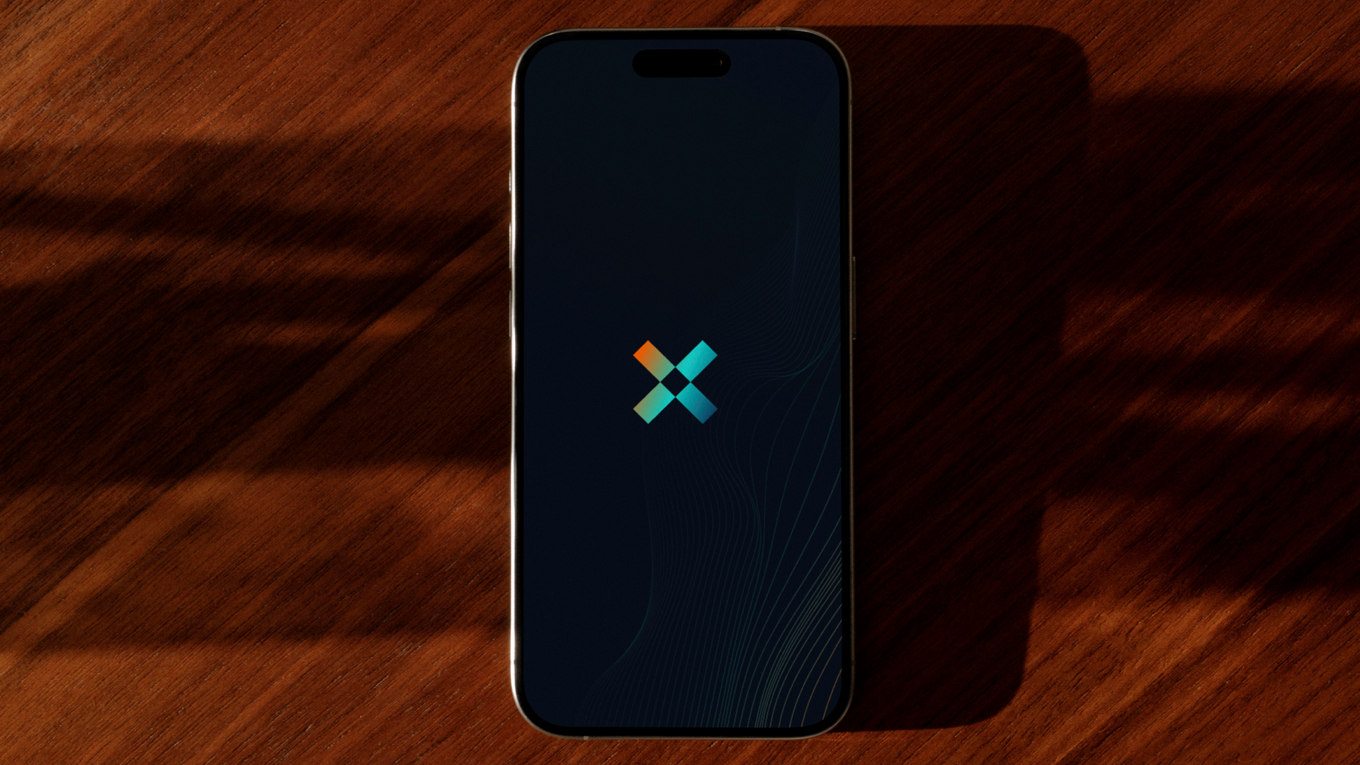
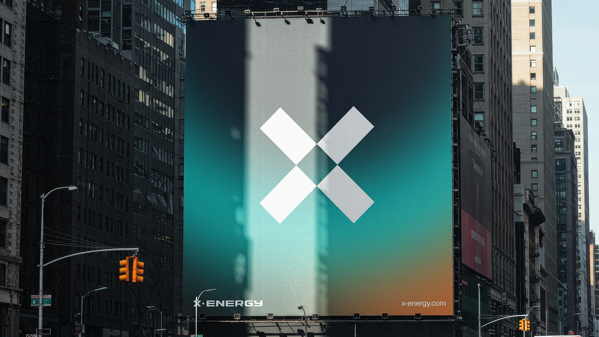
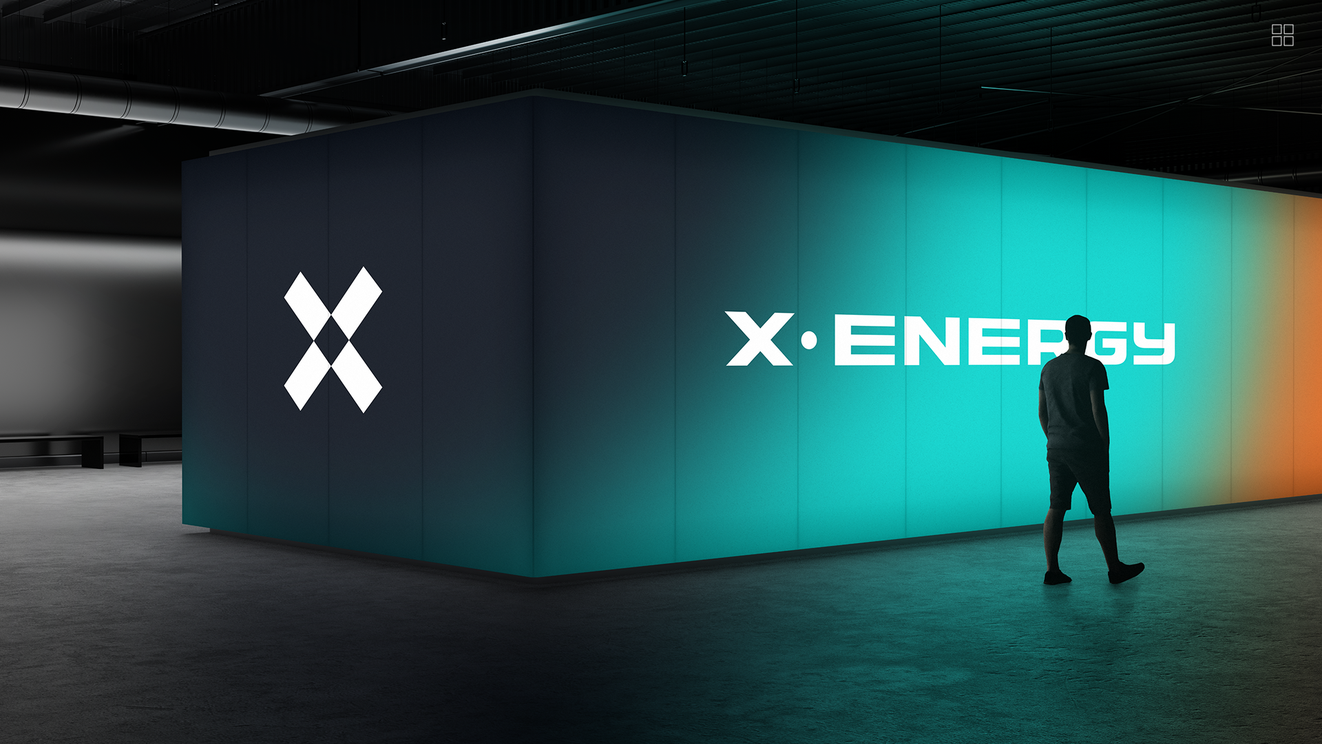
SYMBOL
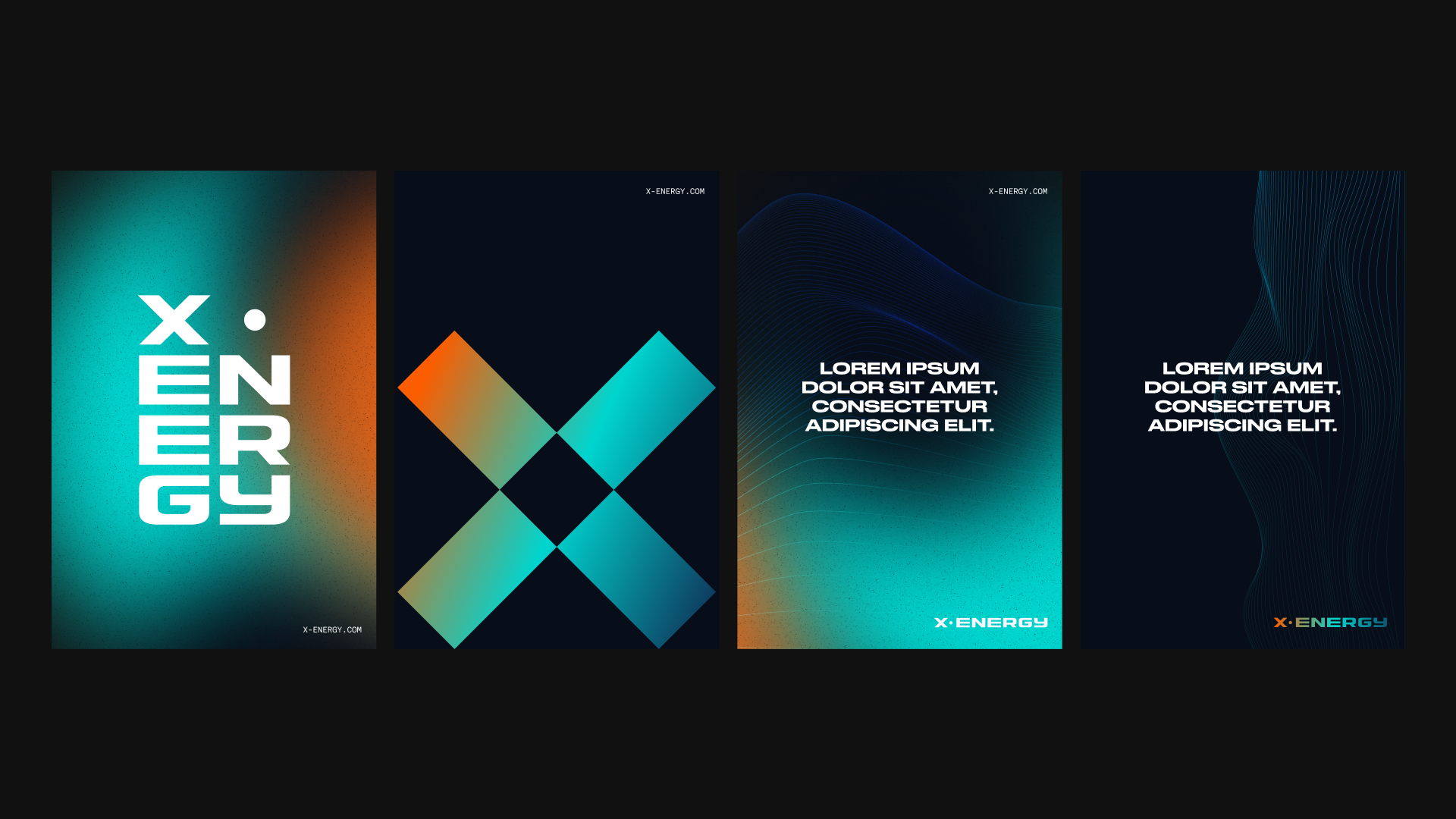
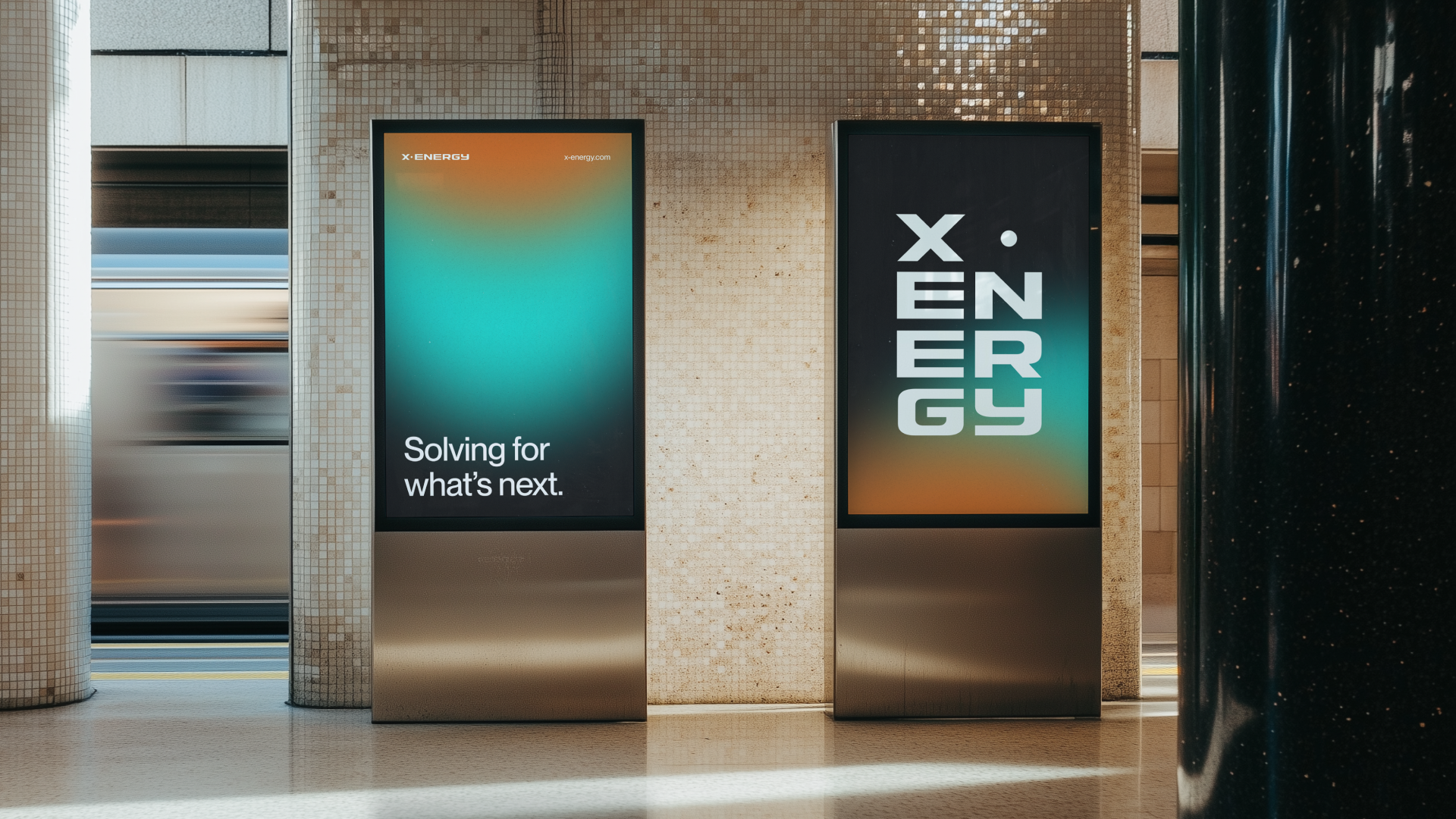
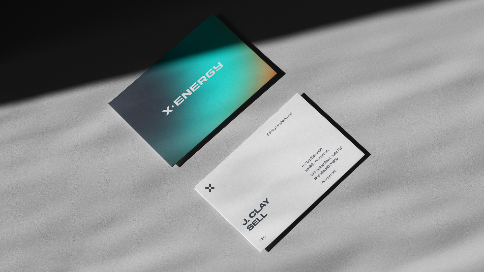
We ultimately retained the original symbol and refined the wordmark to feel distinctly bespoke.
From there, the system was extended across X-Energy’s sub-brands - including fuel and generator divisions - with both horizontal and stacked configurations to ensure flexibility across applications.
WORDMARK
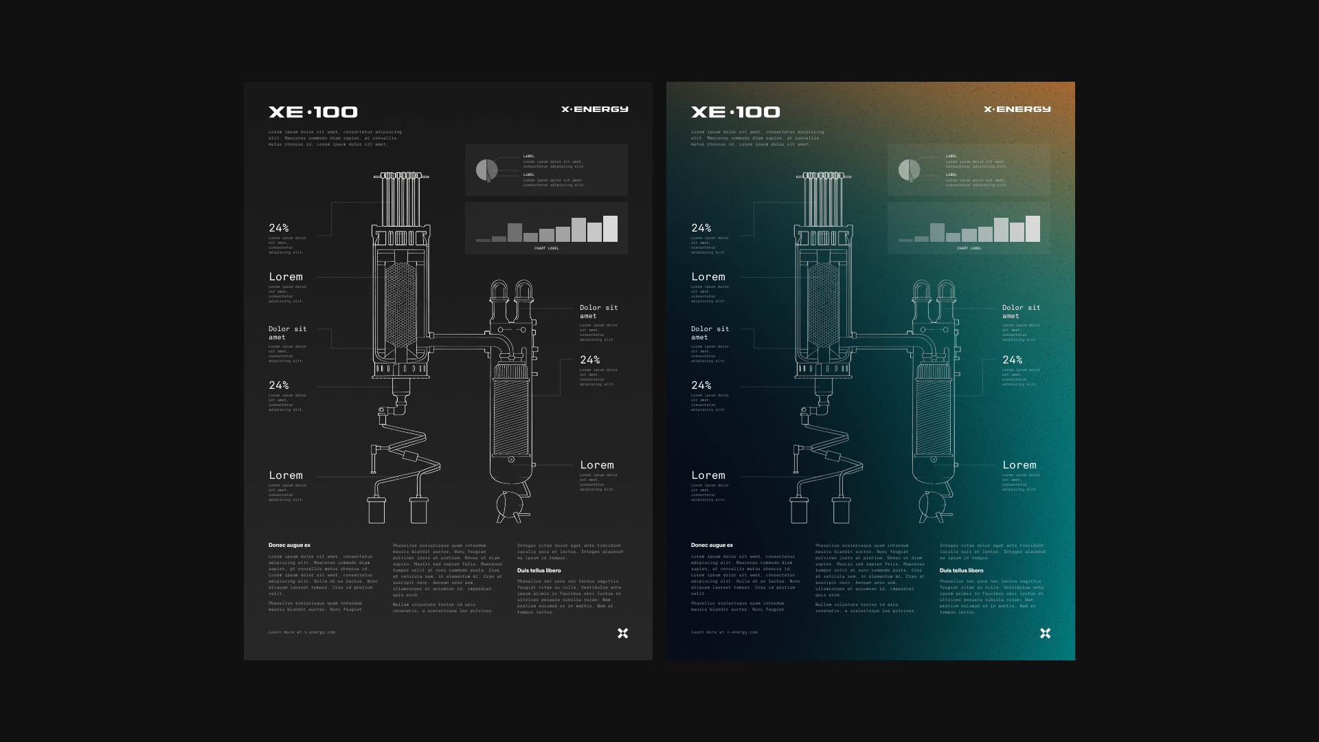
TEXTURES & ICONOGRAPHY
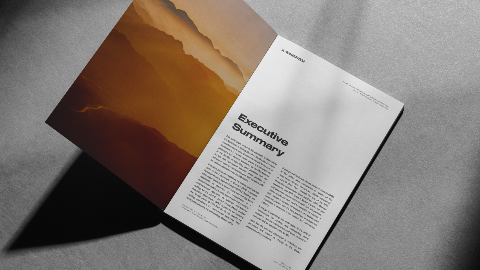
I built a robust photography library grounded in the new brand guidelines, sourcing and curating imagery designed for long-term, flexible use across the brand.
Alongside this, we developed a supporting library of icons and graphic elements - ensuring the visual system was cohesive, extensible, and ready to scale across teams and applications.
TexturesICONOGRAPHYFINAL COLOURWAY SEARCH
I explored the colour palette, testing multiple refined directions grounded in the meaning and symbolism of each colour.
The final selection was driven by clarity and intent - reinforcing the brand’s values while remaining flexible across applications.
COLOURWAY ONE: SUN & SEACOLOURWAY TWO: PROMISECOLOURWAY THREE: UNITYCOLOURWAY four: auroraCOLOURWAY four: TRANQUILITY, SAFETY AND INNOVATIONCOLOURWAY FIVE: TODAY, TOMORROW, THE UNKNOWNFINAL
With the core brand elements approved, then came the rollout of the final system - building a Figma-based library packed with reusable components, print-ready assets, social content, and presentation templates.
The result was a flexible, production-ready brand toolkit designed to scale across teams and channels.