While at Lighthouse Creative, I returned to partner with Ceros to launch a premium interactive content series designed to elevate the brand’s thought leadership.
The goal was clear: showcase real-world growth stories from innovative brands, distil emerging creative trends, and answer the questions Ceros’ customers actually care about — all within a highly interactive web experience.
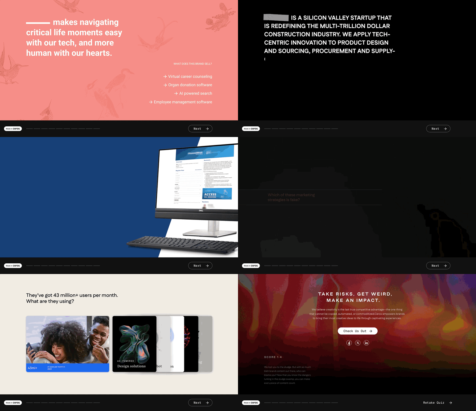
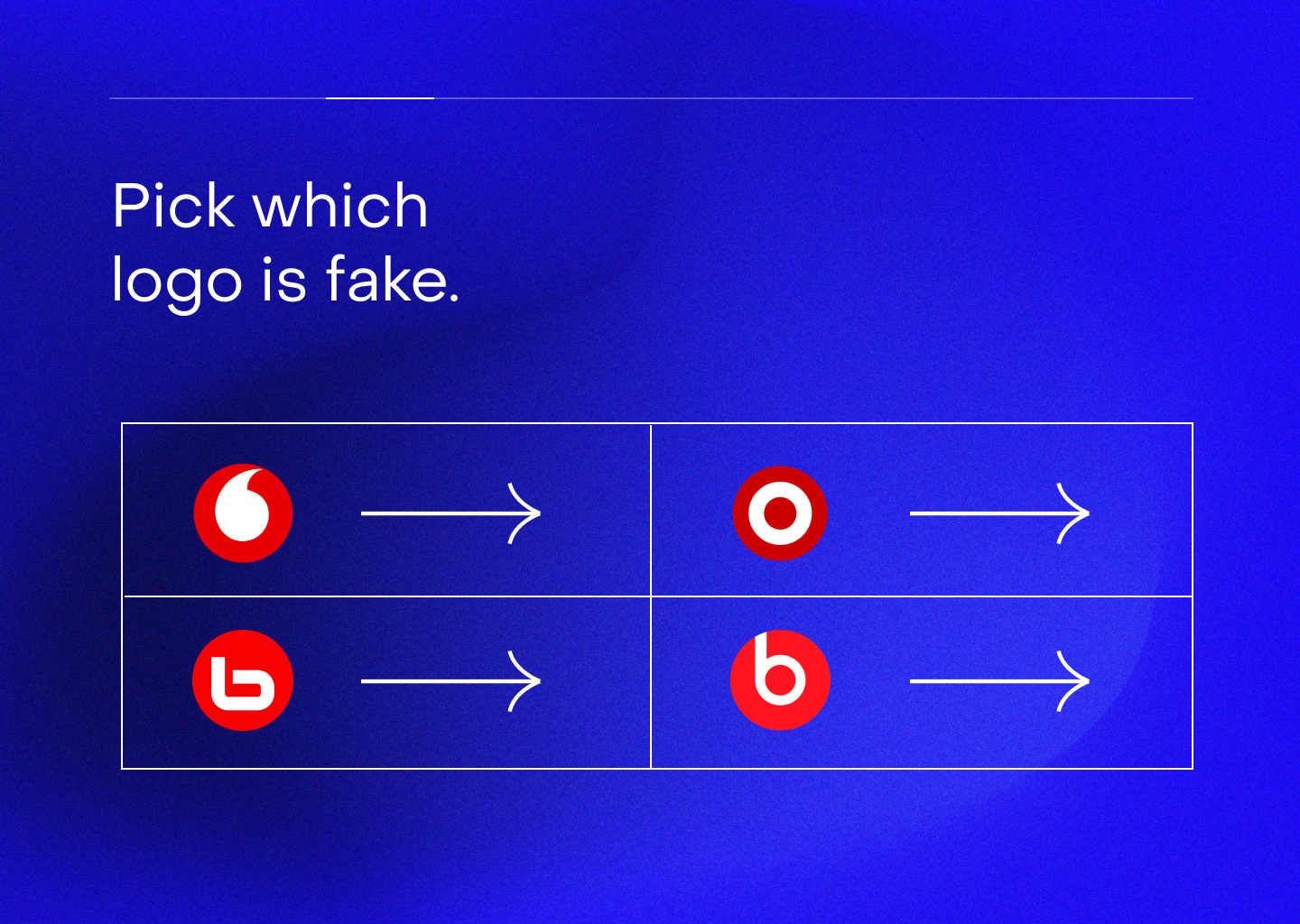
Working closely with Ceros’ creative marketing team and Lighthouse’s content and strategy leads, we launched the first Showcase instalment: When Your Story Is Sludge - a playful, quiz-driven exploration of murky marketing pitches and confusing products.
The result positioned Ceros not just as a platform, but as a confident voice in creative leadership.

THE BRIEF
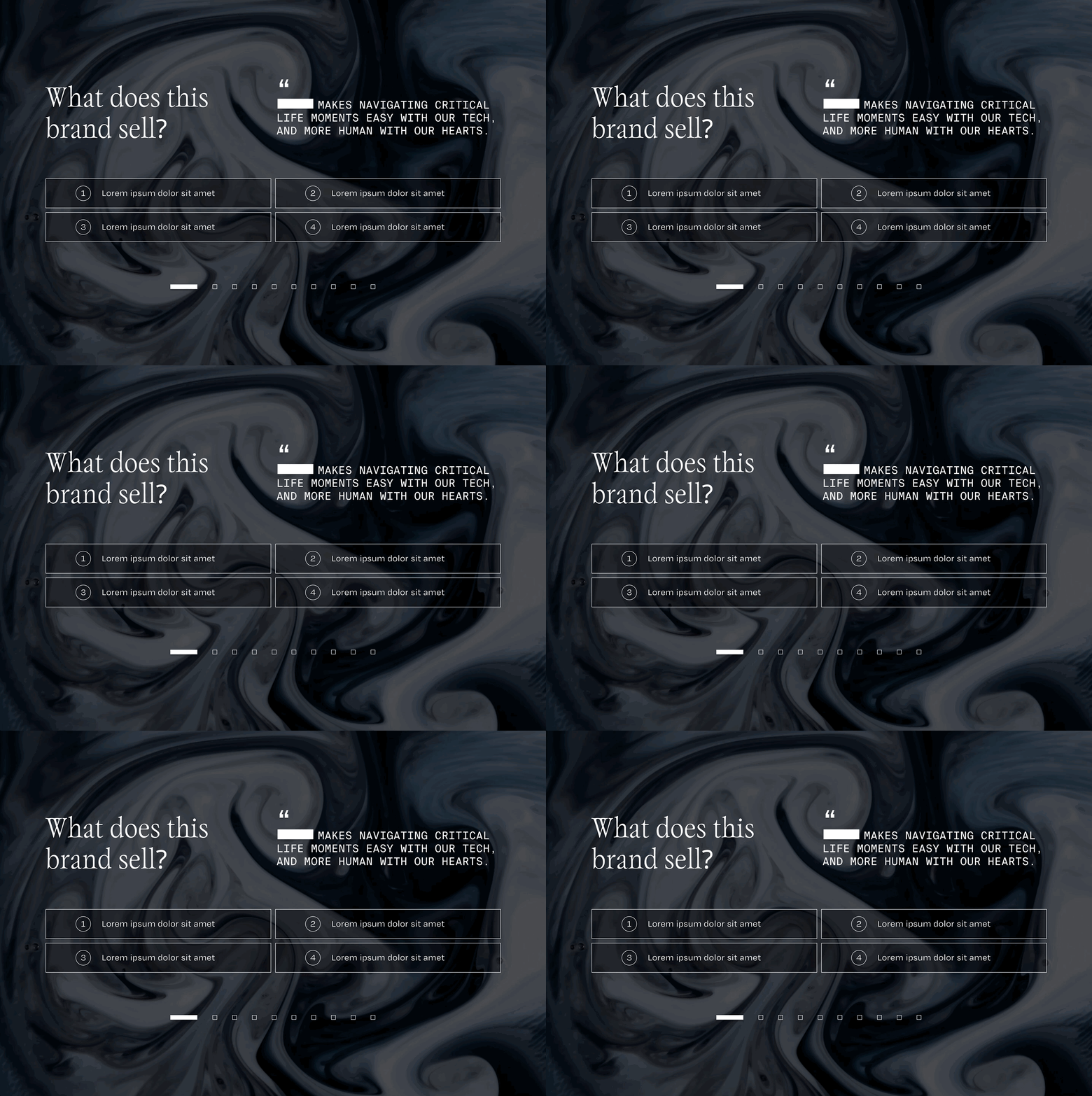
I began with moodboarding and concept development, then moved quickly into wireframing to define the quiz logic and interaction flow.
To pressure-test direction, I designed two distinct visual routes within Ceros’ existing brand system.
While the final experience ultimately pushed further, this phase was a deliberate exploration - testing how far the concept could stretch within a brand actively evolving its visual identity.
THE PROCESS

CONCEPTINGWireframeFURTHER EXPLORATION
We pushed beyond the obvious - expanding both the visual language and interaction model to fully showcase the depth of Ceros’ capabilities.
The goal wasn’t novelty. It was to demonstrate what’s possible when the platform is used to its full potential.
Once the direction was set, I built the final experience directly in Ceros, combining interaction design, visual design, and motion to deliver a cohesive end-to-end experience.
In addition to the interactive build, I designed and animated a custom hero sequence in Adobe After Effects, bringing added energy and polish to the opening and closing moments of the quiz.
THE FINAL
