


THE BRIEFI was a Senior Designer at Ceros, where I led enterprise-level interactive work for some of the company’s most high-profile clients.
Partnering closely with customers, I delivered strategic education and production-ready experiences designed to scale across teams and platforms.
Featured: a responsive web and mobile experience for Kimpton Hotels.
More enterprise projects and processes below.
For every project I delivered at Ceros, I started with a wireframe - and, where it added value, a modular stylescape built for reuse.
These stylescapes weren’t just concepts; they doubled as learning tools, embedding brand systems and flexible modules clients could confidently repurpose across future experiences.
The goal was simple: clients didn’t just walk away with a finished build - they left with clarity, confidence, and a system they could actually use.
THE PROCESS
For this project with RingCentral, I led with a stylescape, established a wireframe, and iterated from concept through to final build in close partnership with their internal designer.
I explored multiple visual directions in Figma to quickly pressure-test different looks and identify the strongest path forward before committing to production.
Accessibility was a non-negotiable. The final experience includes a stop-motion control that allows users to halt all animation - ensuring the interaction was inclusive, considered, and ready for real-world use.
RINGCENTRAL

STYLESCAPE
FINAL SITEKIMPTON HOTELS
I led the design of this responsive web and mobile experience for a client targeting prospective buyers in the wedding space, partnering closely with an Art Director and Project Manager from concept through launch.
The work balanced brand-led storytelling with clear, intuitive UX — giving users multiple, engaging ways to explore the content while remaining easy for the client to update and maintain independently.
After finalising the desktop experience, I stress-tested and refined the mobile version to ensure it performed just as well on smaller screens.
The client set a clear success metric: page views in the first week.
We doubled it.
Weddings at kimpton
Total visitors91,013
91,013
Total page viewsFINAL SITE
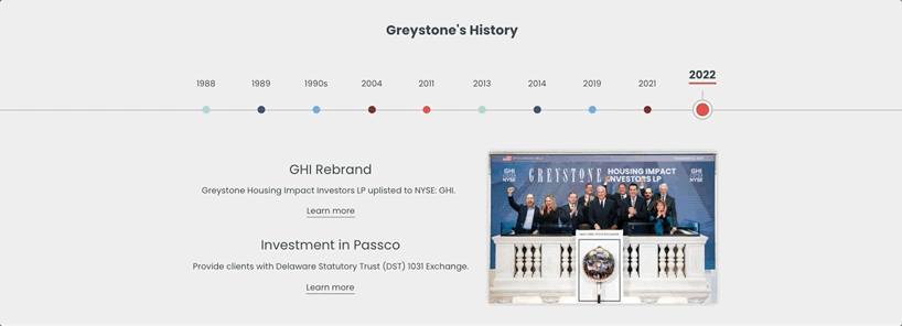
For this Greystone project, I translated an already-approved design into a fully functional interactive experience on Ceros, built to be embedded seamlessly on the client’s own site.
Working to strict specifications, I ensured the experience remained faithful to the original design while performing reliably within the platform.
greystone
While desktop and horizontal tablet layouts were defined, I led the mobile adaptation — rethinking the experience for vertical interaction without losing its core intent.
The interactive wireframe shown here was used to clearly communicate the conversion approach before moving into build.
MOBILE CONVERSION
FINAL EMBED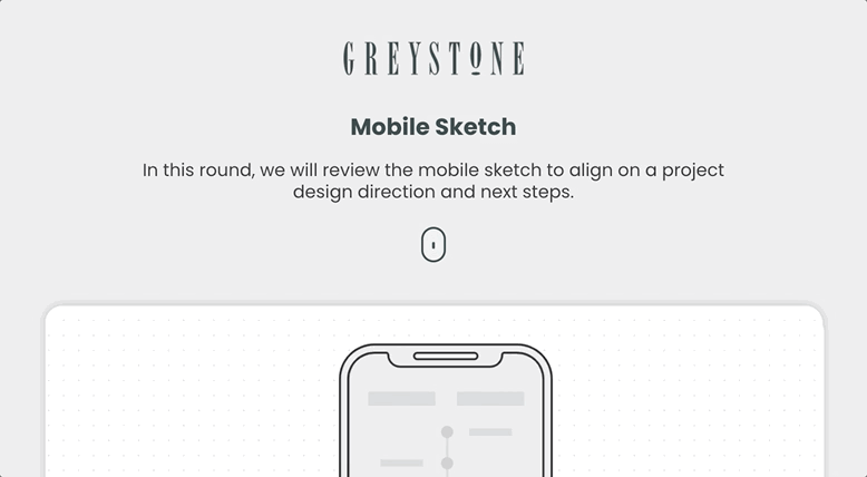
MOBILE WIREFRAME