

THE BRIEFI contributed to the brand development for Perle, an AI platform focused on high-quality, scalable data labelling, annotation, and RLHF, initiated by Kiva.ai.
Working within a human-centred approach to AI, I helped shape elements of the visual identity, social presence and website landing page - supporting a brand positioned to make advanced, specialised AI development feel credible, accessible, and grounded in real expertise.
Kiva.ai set out to redefine how an AI infrastructure company shows up - in a category crowded with sameness.
These were the goals: differentiate from competitors relying on identical palettes and jargon-heavy positioning; make a complex, technical offering feel genuinely approachable; and build a brand people recognise, trust, and want to be part of.
The ambition was bigger than visibility. They wanted to create a beloved, human-centred AI brand - attracting top talent and earning preference from teams of all sizes looking to build specialised AI solutions.
We explored three distinct brand and naming directions to pressure-test Kiva.ai’s positioning.
THE PROCESS
From there, we explored a range of logo concepts - each grounded in a distinct meaning and strategic intent.
LOGOS
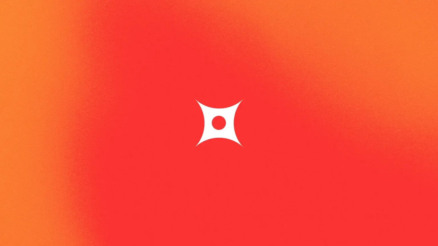
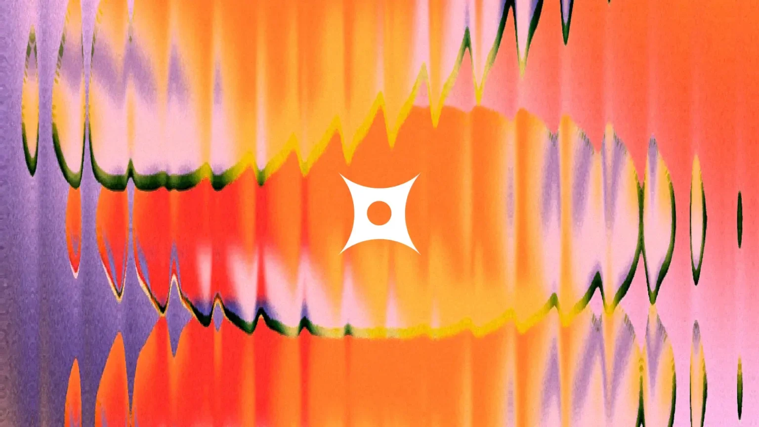
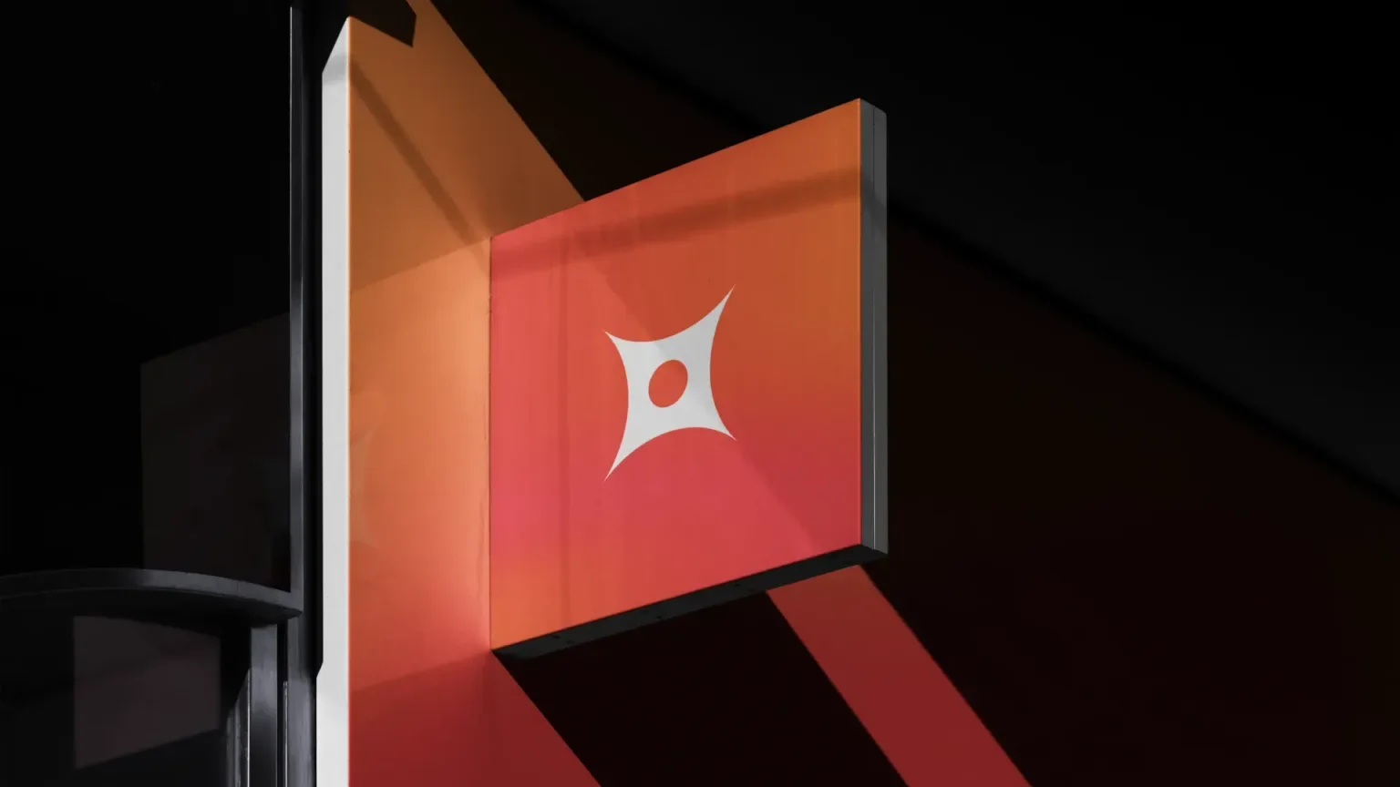
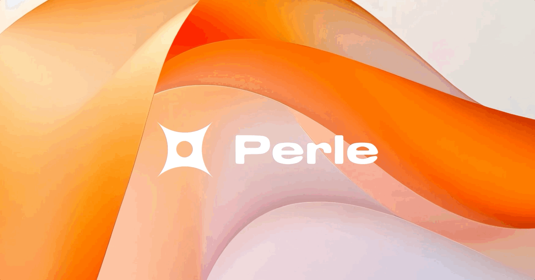
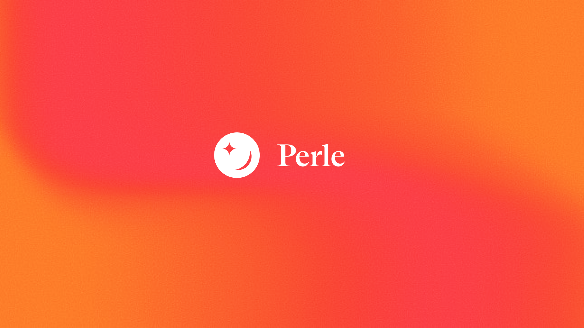
PERLE
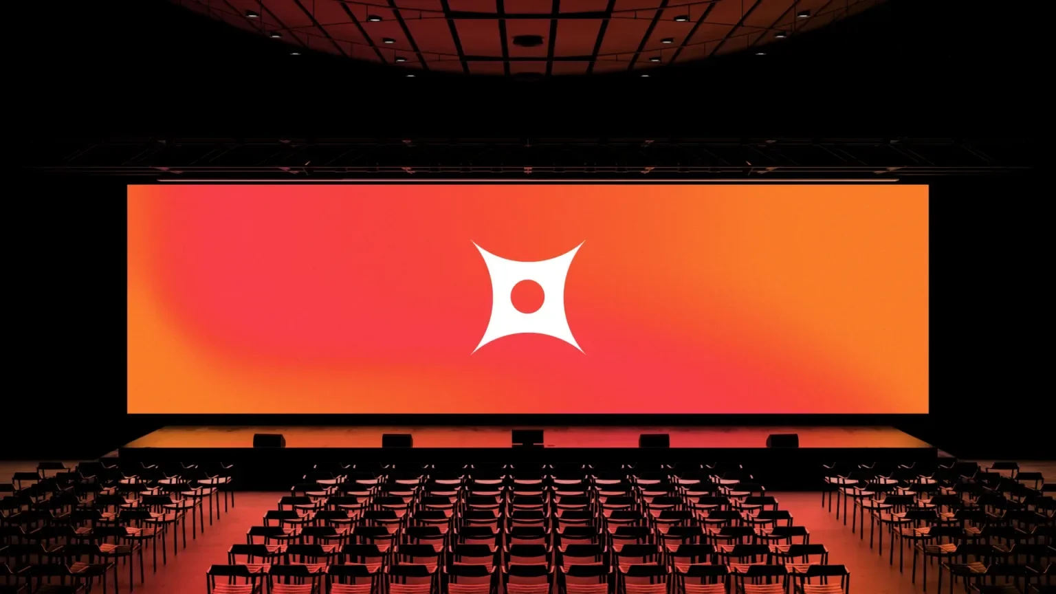
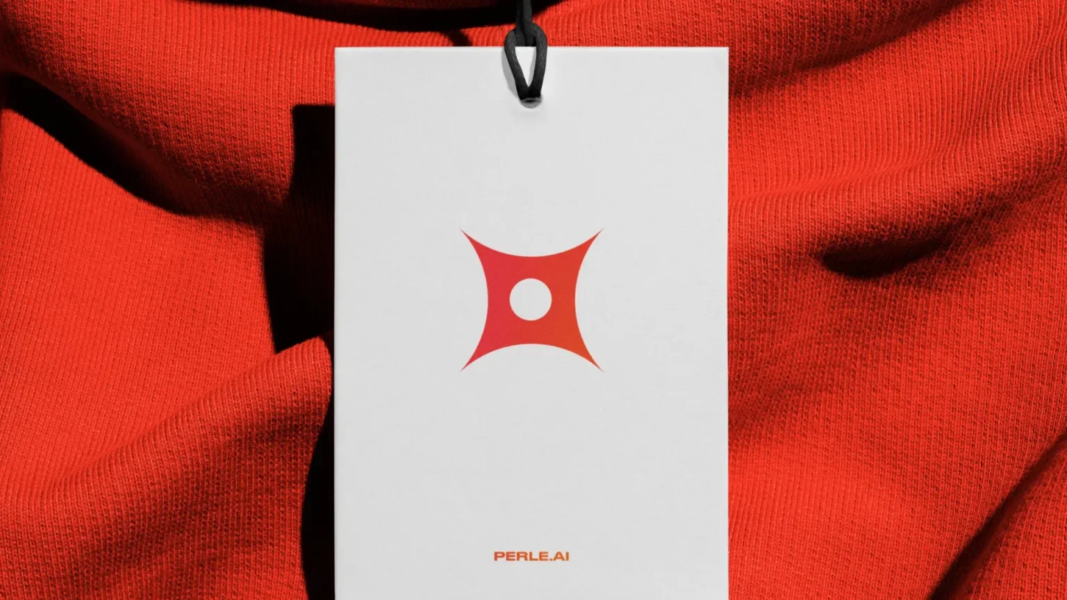
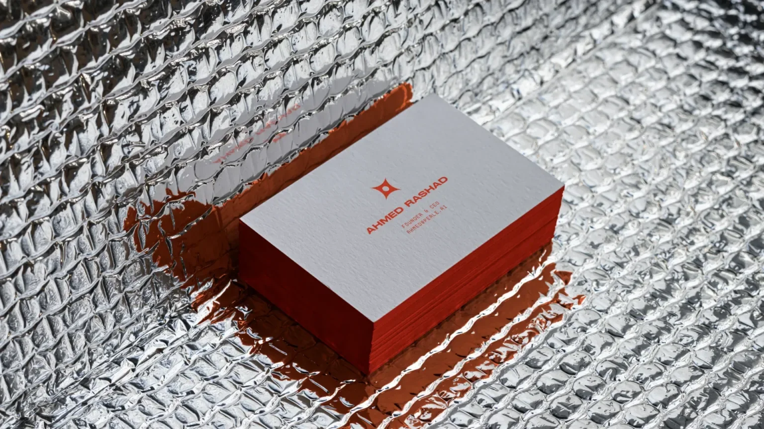
The chosen direction - Perle - captures the core idea behind the platform: something valuable surfaced from complexity.
The name and identity were designed to feel elegant, memorable, and precise, with a visual language that reinforces clarity rather than obscuring it.
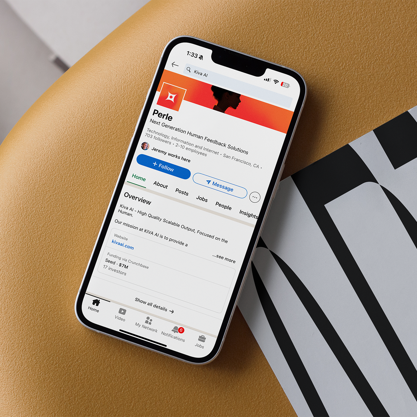
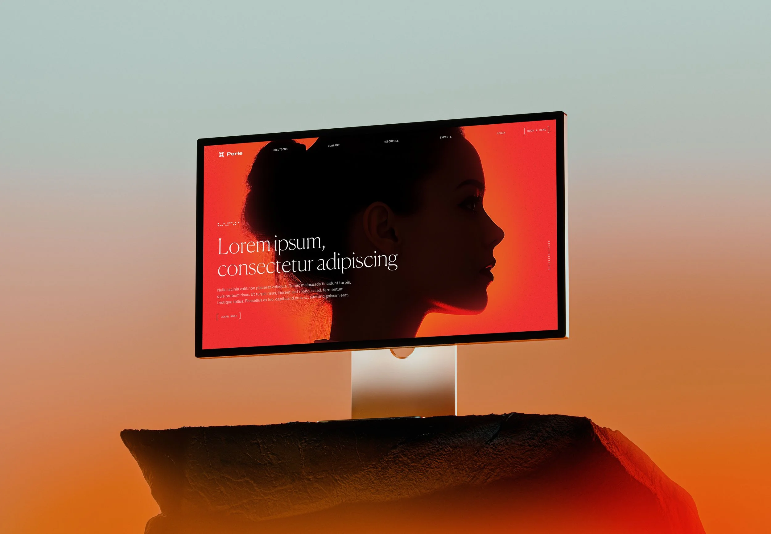
From there, the system expanded across iconography, motion, web, and social — each element designed to feel intelligent, approachable, and unmistakably human.